The Magic of Vintage Colors: Why Retro Tones Feel So Comforting
There’s something about vintage colors that feels instantly familiar. Even if you never lived through the 1950s or 1960s, retro poster tones can still make you feel grounded, calm, and quietly optimistic. That reaction isn’t accidental. It’s rooted in color psychology, memory, and the way artists once used color to tell stories about places and experiences.
Whether you love vintage Americana posters, enjoy browsing old roadside attractions, or are searching for a meaningful gift, retro poster art often pulls you in before you even realize why. Let’s explore what makes these colors so comforting—and how they continue to inspire modern retro poster collections today.
Why Vintage Colors Feel Familiar (Even If They’re Not)
Retro colors tend to be softer, warmer, and more muted than many modern palettes. Instead of sharp contrasts and neon brights, vintage posters relied on tones that felt approachable and human. Think dusty blues, sun-faded reds, buttery yellows, and warm creams.
These colors echo the natural aging of printed materials. Over time, inks faded and paper softened, creating palettes that now feel nostalgic by default. As a result, when we see these tones today, our brains associate them with memory, history, and slower moments.
In contrast, modern digital colors can feel intense or overwhelming. Vintage colors, however, give your eyes a place to rest. That’s one reason retro poster art works so well as wall art—it quietly enhances a space instead of dominating it.
The Emotional Power of Muted Blues and Warm Neutrals
Blue is one of the most psychologically comforting colors, especially when it’s softened. In retro posters, blues often lean toward teal, denim, or sky tones rather than pure primary blue. These hues suggest open roads, wide skies, and calm horizons.
Warm neutrals—like tan, cream, and soft gray—add balance. They ground the image and create a sense of timelessness. Together, these colors feel steady and reassuring, which is why they work so well in Americana-themed artwork.
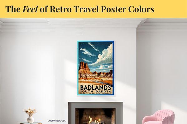
In my Big Sky Retro Travel Posters Collection, these color relationships are intentional. Wide skies, open land, and simplified palettes help recreate that peaceful “on the road” feeling many of us associate with classic American travel.
How Retro Colors Trigger Nostalgia and Memory
Nostalgia doesn’t always come from lived experience. Often, it’s borrowed. Old postcards, road trip photos, and classic travel posters shape how we imagine the past. Retro colors act as visual shortcuts, helping us step into those imagined memories.
For example, faded reds and oranges often appear in vintage roadside signs and motel imagery. These colors convey warmth, friendliness, and excitement—without feeling loud. Meanwhile, muted greens connect us to national parks, back roads, and open landscapes.
This combination makes retro poster art especially popular as gifts. When someone opens a print featuring vintage tones, it feels personal. It suggests shared memories, favorite places, or trips that still live in the imagination.
Vintage Beach Wall Art
Coastal scenes benefit especially from retro color palettes. Instead of bright turquoise water and high-contrast skies, vintage beach wall art uses softer blues, sandy neutrals, and sun-washed highlights.
These tones reflect the feeling of long summer days, salt air, and quiet boardwalk mornings. Rather than capturing a single moment, vintage beach art captures a mood. That’s why it resonates with people who love coastal Americana, even if they’re miles from the shore.
If you’re interested in how scale and color work together in smaller rooms, you may enjoy this guide: Best Travel Posters for Small Spaces. Retro tones often make compact areas feel calmer and more cohesive.
Why Retro Poster Colors Make Thoughtful Gifts
Choosing art as a gift can feel intimidating, but vintage-inspired posters make it easier. Their color palettes are forgiving. They blend into many styles without demanding a perfect match.
More importantly, retro colors carry meaning. They suggest appreciation for history, travel, and craftsmanship. Giving someone a vintage-style poster says, “I know what you love,” without saying it out loud.
That’s especially true for people who enjoy Americana, road trips, or iconic landscapes. Retro travel posters allow them to revisit favorite places—or dream about future adventures.
The Role of Simplicity in Retro Color Design
Another reason vintage colors feel comforting is simplicity. Retro posters typically use fewer colors, allowing each tone to breathe. This restraint keeps the image readable and emotionally clear.
By limiting the palette, artists guide your eye through the scene. You notice the sky first, then the land, then the typography. Everything works together instead of competing for attention.
This approach still influences how I create modern retro-inspired posters today. The goal isn’t realism. It’s feeling.
Why Retro Colors Still Matter Today
In a fast-moving digital world, vintage colors remind us to slow down. They recall road trips without GPS, handwritten postcards, and roadside stops that weren’t optimized for algorithms.
That’s why retro poster art continues to grow in popularity. It offers comfort, familiarity, and a sense of place—all through color.
If you’d like to explore more vintage-inspired artwork, visit the Bob Pardue Photography homepage for stories inspired by classic Americana, travel, and nostalgia.
Sometimes, the right colors don’t just decorate a wall. They tell a story you already know—and one you never want to forget.
Oh, please take time to check out my book, “” over at Amazon. You can see all the details here.